


Osmanlı Nesih Hurufatının Soyağacını Görselleştirmek
Kimi nevi şahsına münhasır kimi ise kopya niteliğindeki Osmanlı nesih hurufatı arasındaki ilişkilerin görselleştirilmesi süreci üzerine.
Last year, an ISType conference was held focusing on Arabic script typography. This conference was also organized in the spirit of a book launch event for Arabic Typography: History and Practice. I wrote a chapter in this book which scrutinizes the text types that were produced and used in Ottoman print culture.1 My section examines the Arabic foundry types that were cut in the naskh style and employed for continuous text setting in the Ottoman printing presses. This chapter concluded with an information visualization—first published in my PhD thesis—displaying the intricate genealogical relationships between fifteen Ottoman naskh typefaces.2 In this article, we will share the design process of this visualization with Deniz Cem Önduygu who designed it.
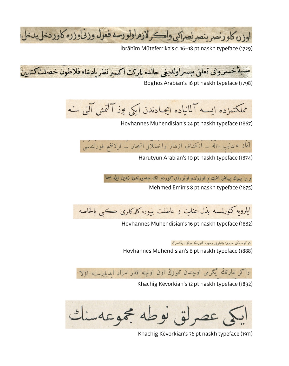
My thesis dealt with the identification and examination of various naskh fonts printed in Istanbul.3 It covered the period from the emergence of the first Ottoman Arabic type published by İbrahim Müteferrika in 1729 to the Turkish script reform in 1928. As a result, fifteen naskh foundry types that were visually and technically different from each other were identified.4 Then I listed typefaces by six punch-cutters; Boghos Arabian, Hovhannes Muhendisian, Harutyun Arabian, Mehmed Emin, Khacig Kevorkian, and Mehmed Ali, respectively. While some of these type-makers’ fonts were original in the sense of their “designs”, some bore near identical shapes with older ones, suggesting they were copies of their predecessors. This made me think that the information I was trying to gather might actually have a larger, genealogical, relationship. Following this, I vertically lined up the images of the nine original typefaces—excluding six fonts that were mere copies (Figure 1).
While this visual setting explicitly portrayed the differences, it did not include six other fonts that were copies of the ones listed here. I was, however, aware from the very beginning that fonts that were copies of others were also important historical and typographic data. Experts on this subject could easily notice the differences between these letter shapes, but considering the broader audience, people unfamiliar with the Arabic script might have difficulty perceiving these intricate relationships. That’s why I thought information design would clarify the murky waters of this data land. Then, in the manner of “Who you gonna call? Ghostbusters!”, I knocked on Cem’s door.
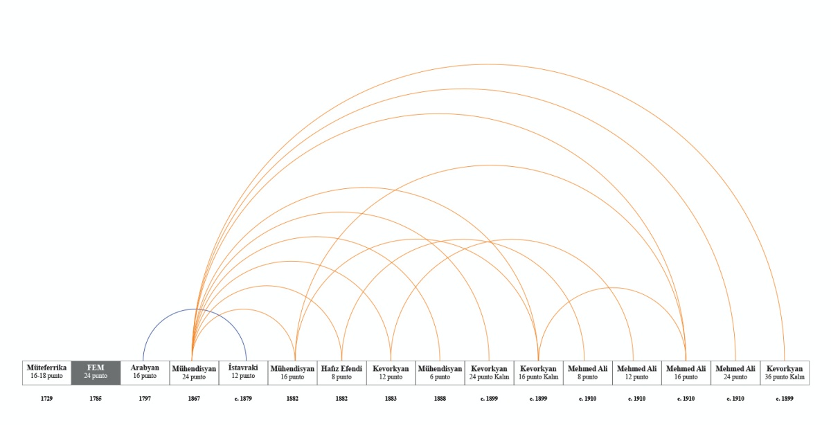
Figure 2. Onur’s visualization draft.
In Cem’s study, after explaining to him what I was after, I showed him the draft graphic I created (Figure 2), inspired by the semicircular connections he used in his History of Philosophy: summarized and visualized. Then he spotted that the number of data categories we had was actually suitable for a visualization with more dimensions, and we got to work.
Our main aim was to display the relationships between fonts which were influenced by or copied from each other. Additionally, we had other parameters for each font, such as point sizes and first use dates. Another kind of relationship we were interested in displaying was the groupings between fonts of the same design produced in different sizes.
After showing the time dimension on the horizontal axis—as is customary—we tried to use the vertical axis for point size and realized that the resulting layout allowed us to clearly display the influence, copying, and grouping relationships. This distribution on the vertical axis not only revealed the overall change in the range of point size over time, but also made it easier to grasp the three kinds of connections by differentiating them structurally. For instance, the relations of direct copies were represented by strictly horizontal lines whereas the grouping relations of fonts of different point sizes belonging to the same design (Kevorkian c. 1900, Mehmed Ali c. 1910) were represented by strictly vertical lines (Figure 3).

After placing the fonts as points in this scatter plot according to their dates and sizes, we added a correctly sized image of the printed wāw (و) in a rectangle (like a sort) for each font on the plot. This addition enriched the visualization with a new type of visual information about the designs of the fonts, and at the same time allowed the viewer to see the point sizes more directly and intuitively. Taking this enrichment further, we decided to place indexed sample text images from each original typeface below the graph. Lastly, we added the only surviving photograph of an Ottoman type-foundry—to our knowledge—uncovered in my research, in order to help the viewers envision the period and the atmosphere. We used Duru Sans as the Latin typeface in the visualization since its calligraphic structure and discretionary ligatures worked well with the Arabic script. For the digital Arabic font, DecoType Naskh was chosen due to its visual references to the Ottoman school of naskh. With a general audience in mind, we chose to go with the simplified transcription alphabet for the names of Armenian and Turkish punch-cutters.
Before this visualization, I wasn’t able to see a pattern which later became visible and led to an “Aha!” moment: In the middle of the graphic—over a period spanning nearly two decades—the tendency of producing type in very small point sizes had become apparent. The visualization helped me further realize the cause–effect relationship between the pocket-sized book production flourishing during this period and small type production. This reminds us of the function of and the need for and data/information visualization besides its fancy aesthetics. The graphic also reveals how Muhendisian’s typefaces—based on Kādıasker Mustafa İzzet’s naskh pen—provided the visual basis for the following generations and how such a calligrapher’s style played a major role in the formation of this typography culture. Mehmed Ali’s proudly presented type-specimen catalogs, printed around the Second Constitution period, explicitly lays out the already established Muhendisian école. This further emphasizes the two indispensable conditions for the formation of Ottoman text typefaces: A canonized calligraphy style and an extremely competent punch-cutter to accurately produce it on steel and lead.
1. Onur Yazıcıgil, “The Genealogy of Ottoman naskh printing types (1729-1928)”, in Arabic Typography: History and Practice, ed. Titus Nemeth (Salenstein: Niggli, 2023).
2. Onur Yazıcıgil, “Osmanlı İmparatorluğu’nda Nesih Hattının Tipografik Evrimi (1729–1928)” (Phd Thesis, Mimar Sinan Güzel Sanatlar University, Graphic Design Program, 2020).
3. Following İbrahim Müteferrika’s type, another naskh type was identified which was used by the French Consulate of Istanbul around 1785. Since the visual features of this type draws extreme similarities to the category of European Arabic types, I excluded it from my Ottoman Arabic type research.
4. During my research I realized that sometimes copies of original designs were produced. In fact some type-makers such as Mehmed Ali presented such copies as original typefaces in their commercial type specimen catalogs. It can be inferred from the discrepancies found in some of the letter shapes, that these copies were cast on different matrices. This is why I considered these typefaces not as the re-cast version of the original version but rather as a copied and re-produced version of the initial design. This is perhaps why some type-makers sought “imtiyaz” (copyright) protection of their design from the state. For more information on the physical properties of Ottoman foundry types see Onur Yazıcıgil, “Osmanlı Matbuatının Sekiz Punto Nesih Yazı Karakteri ve Türk Hurufat Yapımcısı Mehmed Emin Efendi”, Sanat Tarihi Yıllığı 31 (Haziran 2022): 567-602.
Deniz Cem Önduygu, English language content, font, grafik tasarım, grafik tasarım tarihi, Onur Yazıcıgil, tipografi, veri görselleştirme